效果图
分页的情况也支持良好:
为什么
为什么要用垂直标签页?
因为我乐意。
也因为垂直标签页可以同时呈现更多的内容。
为什么不用插件?
想用也可以用,都行,都可以。
不过插件会占用侧栏,而且也无法利用一些原生标签页的特性。
(例如 Frontmatter Title 插件的命名修改)
实现方法
把下面这个 CSS 文件放进你的库里,启用对应 CSS Snippets。
详细教程:如何在OB内应用CSS修改
/* Moy-垂直标签页.css */
/* 2025-04-14 */
/* 从 MicroMike 主题中提取出来:https://github.com/ThisTheThe/MicroMike */
/* 作者还提供了更多的 Snippets可选:https://github.com/ThisTheThe/MicroMike/tree/main/Snippets */
/* 经过 @熊猫别熬夜 的调整改动,感谢! */
/* 可以配合熊猫的这个样式一起使用,体验更佳: */
/* 悬浮侧边栏: https://forum-zh.obsidian.md/t/topic/32602 */
/* 2025-04-16 */
/* V 2.0 */
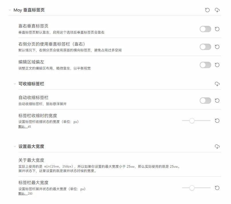
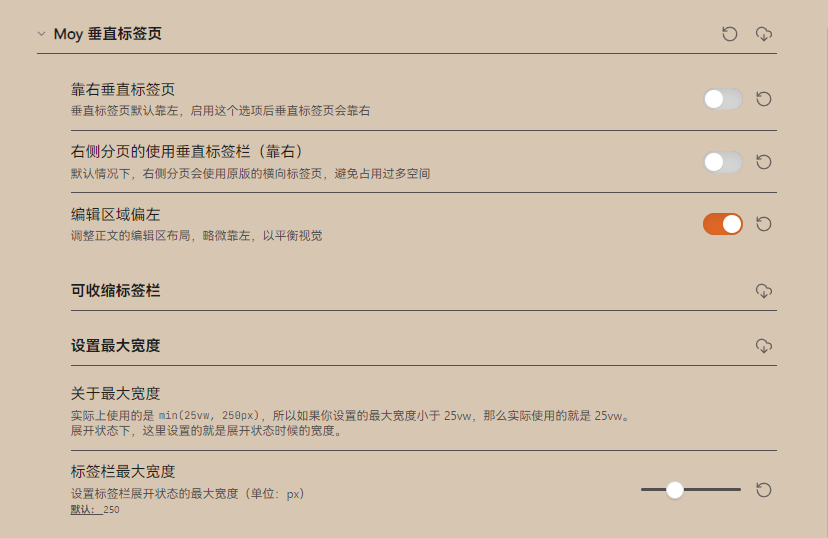
/* 新增诸多 Style Sttings 可选项:
1. 垂直标签栏的位置(左/右可切换)
2. 右侧分页的优化:默认情况下使用标准水平标签栏,可选择使用垂直标签栏(靠右)
3. 支持标签栏自动收缩(并且有可爱的羽化过渡文本效果!)
4. 支持各项宽度设置:收缩时宽度、展开时宽度、最大宽度等
*/
/** Style Settings 开关 **/
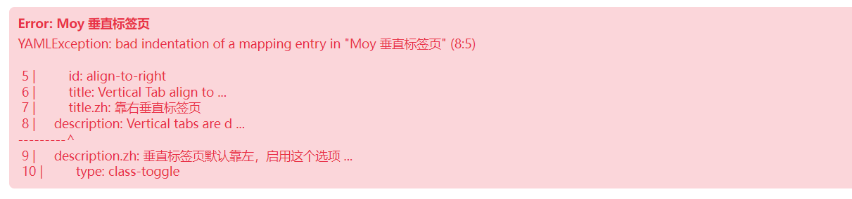
/* @settings
name: Moy 垂直标签页
id: moy-vertical-tabs
settings:
-
id: align-to-right
title: Vertical Tab align to Right
title.zh: 靠右垂直标签页
description: Vertical tabs are default aligned to the left, after enabling this option, vertical tabs will be aligned to the right
description.zh: 垂直标签页默认靠左,启用这个选项后垂直标签页会靠右
type: class-toggle
default: false
addCommand: true
-
id: right-panel
title: Make Right Panel Use Vertical Tabs (Right side)
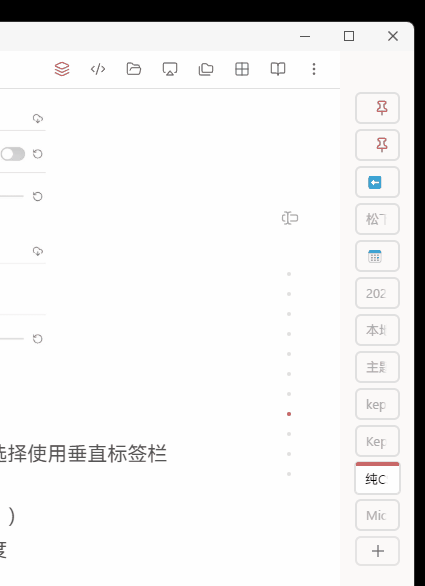
title.zh: 右侧分页的使用垂直标签栏(靠右)
description: By default, the right panel will use the original horizontal tab to avoid taking up too much space
description.zh: 默认情况下,右侧分页会使用原版的横向标签页,避免占用过多空间
type: class-toggle
default: false
addCommand: true
-
id: adjust-editor-layout
title: Adjust Editor to the Left
title.zh: 编辑区域偏左
description: Adjust the layout of the editor area, slightly to the left, to balance the visual
description.zh: 调整正文的编辑区布局,略微靠左,以平衡视觉
type: class-toggle
default: false
addCommand: true
-
id: collapse-header
title: Collapsable Tabs
title.zh: 可收缩标签栏
type: heading
level: 2
collapsed: true
-
id: auto-collapse-tabs
title: Auto Collapse Tabs
title.zh: 自动收缩标签栏
description: Auto collapse the tabs when not in use
description.zh: 自动收缩标签栏,鼠标悬浮展开
type: class-toggle
default: false
addCommand: true
-
id: tab-area-collapsed-width
title: Tab Area Collapsed Width
title.zh: 标签栏收缩时的宽度
description: Set the width of the tab area when collapsed
description.zh: 设置标签栏收缩状态的宽度(单位:px)
type: variable-number-slider
default: 45
format: px
min: 20
max: 100
step: 5
-
id: max-width-title
title: Set Max Width
title.zh: 设置最大宽度
type: heading
level: 2
collapsed: false
-
id: max-width-info
title: Max Width Info
title.zh: 关于最大宽度
description: The max-width is actually set to `min(25vw, 250px)`, so if you set the max width less than 25vw, it will actually use 25vw.\nIn the expanded state, this is the width when expanded.
description.zh: "实际上使用的是 `min(25vw, 250px)`,所以如果你设置的最大宽度小于 25vw,那么实际使用的就是 25vw。\n展开状态下,这里设置的就是展开状态时候的宽度。"
type: info-text
markdown: true
-
id: tab-area-max-width
title: Tab Area Max Width
title.zh: 标签栏最大宽度
description: Set the width of the tab area
description.zh: 设置标签栏展开状态的最大宽度(单位:px)
type: variable-number-slider
default: 250
format: px
min: 160
max: 320
step: 10
*/
/* --------------------------- */
/* 内置变量(未安装 SS 也可使用) */
/* --------------------------- */
body {
/* 标签栏收缩状态的宽度 */
--tab-area-collapsed-width: 45px;
/* 标签栏展开状态的宽度 */
--tab-area-max-width: 250px;
}
/* ! 样式定制 */
/* 标签栏 padding 调节 */
.workspace .mod-root .workspace-tab-header {
/* 默认:1px 3px 3.5px */
padding-top: 2px;
padding-bottom: 2px;
padding-right: 3px;
}
/* 上方空白区域的背景色 */
.workspace-tabs.mod-top-left-space,
.workspace-tabs.mod-top-right-space {
background: var(--tab-container-background);
}
/* ! 调整垂直标签页的固定宽度 */
/* 标签栏的宽度 */
.workspace .mod-root
.workspace-tab-header-container .workspace-tab-header {
width: var(--tab-area-max-width);
max-width: min(25vw, var(--tab-area-max-width));
}
/* 因为视觉会不太平衡,所以中间编辑区的内容也往左挪 */
.adjust-editor-layout .markdown-preview-sizer.markdown-preview-section,
.adjust-editor-layout .mod-root .cm-editor .cm-sizer {
margin-left: max(4em, 10%) !important;
}
/* ! 标题文本渐变效果 */
.workspace .mod-root .workspace-tab-header-container .workspace-tab-header .workspace-tab-header-inner .workspace-tab-header-inner-title { /* 增加四周的渐变蒙版 */
-webkit-mask-image: linear-gradient(to left,
transparent 0px, transparent 5px,
#fff 10px, #fff);
mask-image: linear-gradient(to left,
transparent 0px, transparent 5px,
#fff 10px, #fff);
mask-composite: intersect;
-webkit-mask-composite: source-in, xor;
}
/* ! ------------------- ! */
/* ! FEAT: 自动收缩标签栏 ! */
/* ! ------------------- ! */
.auto-collapse-tabs .workspace.is-left-sidedock-open .mod-root .workspace-tabs:not(.mod-top-right-space),
.auto-collapse-tabs .workspace .mod-root .workspace-tabs.mod-top-left-space,
.auto-collapse-tabs.right-panel .workspace.is-right-sidedock-open .mod-root .workspace-tabs:not(.mod-top-left-space),
.auto-collapse-tabs.right-panel .workspace .mod-root .workspace-tabs.mod-top-right-space
{
.workspace-tab-header-container .workspace-tab-header {
width: var(--tab-area-collapsed-width, 45px);
.workspace-tab-header-inner-title {
white-space: nowrap !important;
overflow: hidden;
text-overflow: clip !important;
/* margin-right: -1em; */
margin-left: auto;
margin-right: auto;
left: 2px;
}
/* .workspace-tab-header-status-container, */
.workspace-tab-header-inner-close-button {
display: none;
}
}
/* 鼠标悬浮状态的收缩标签栏 */
.workspace-tab-header-container:hover .workspace-tab-header {
/* width: min(25vw, 250px); */
/* width: 220px; */
width: var(--tab-area-max-width);
transition: width 0.5s ease; /* 鼠标悬停时,立即变化 */
transition-delay: 50ms !important;
.workspace-tab-header-inner {
--fade-size: 0px;
}
}
.workspace-tab-header-container:hover .workspace-tab-header:has(.workspace-tab-header-inner:hover) {
.workspace-tab-header-status-container,
.workspace-tab-header-inner-close-button {
display: block;
}
}
.workspace-tab-header-container:not(:hover) .workspace-tab-header {
transition: width 0.5s ease; /* 默认状态下,变化延迟 2 秒 */
transition-delay: 220ms !important;
}
}
/* ------ */
/* ! ------------------- ! */
/* ! 垂直 Tabs 布局 */
/* ! ------------------- ! */
/* !将标签容器改为横向布局 */
/* ! BASIC */
.workspace.is-left-sidedock-open .mod-root .workspace-tabs:not(.mod-top-right-space),
.workspace .mod-root .workspace-tabs.mod-top-left-space {
flex-direction: row;
}
/* ! ALTER */
.align-to-right .workspace.is-left-sidedock-open .mod-root .workspace-tabs:not(.mod-top-right-space),
.align-to-right .workspace .mod-root .workspace-tabs.mod-top-left-space,
.right-panel .workspace.is-right-sidedock-open .mod-root .workspace-tabs:not(.mod-top-left-space),
.right-panel .workspace .mod-root .workspace-tabs.mod-top-right-space {
/* !将标签容器改为横向布局 */
flex-direction: row-reverse;
}
.workspace.is-left-sidedock-open .mod-root .workspace-tabs:not(.mod-top-right-space),
.workspace .mod-root .workspace-tabs.mod-top-left-space,
/* 这个比较特殊,有时候单一页面也会加上 right space */
/* 这种情况就先不处理了吧,太麻烦了(而且也未尝不是一种 Feature!) */
/* .workspace .mod-root:not(:has(.mod-top-left-space)) .workspace-tabs.mod-top-right-space, */
.right-panel .workspace.is-right-sidedock-open .mod-root .workspace-tabs:not(.mod-top-left-space),
.right-panel .workspace .mod-root .workspace-tabs.mod-top-right-space {
/* !标签头容器样式 */
.workspace-tab-header-container {
padding-top: 40px;
flex-direction: column;
justify-content: left;
align-items: flex-start;
gap: 5px;
height: 100%;
background-color: var(--background-secondary);
padding-left: 0px !important;
padding-right: 0px !important;
/* !标签头内部容器样式 */
.workspace-tab-header-container-inner {
--animation-dur: 0ms !important;
/* display: grid;
grid-template-columns: repeat(1, 1fr); */
display: flex;
flex-direction: column;
flex-wrap: wrap;
justify-content: flex-start;
gap: 5px;
margin: 0px;
max-height: 90vh;
overflow: scroll;
position: relative;
align-content: start;
}
}
/* !单个标签样式 */
.workspace-tab-header-container-inner .workspace-tab-header:not(.mod-active) {
flex: 0 0 auto;
border-radius: 6px;
border: 2px solid var(--background-modifier-border);
min-height: 1.6rem !important;
/* transition: 200ms; */
}
/* ! 当前tab加上显著边框 by Calmwaves 2023-12-27_10:18:15 */
.workspace-tab-header.is-active {
border-radius: 4px;
min-height: 1.6rem !important;
border-top: 4px solid var(--color-accent) !important;
border: 1px solid var(--background-modifier-border);;
border-bottom: 1px solid var(--background-modifier-border);;
}
/* !标签标题样式 */
.workspace-tab-header-inner-title {
text-overflow: ellipsis;
}
/* !标签按钮样式 */
.workspace-tab-header-inner {
position: relative;
}
.workspace-tab-header-inner-close-button {
position: absolute;
}
/* !新建标签按钮样式 */
.workspace-tab-header-spacer {
display: none;
}
.workspace-tab-header-new-tab {
/* order: -2; */
width: 100%;
margin: 0px;
padding: 0px 15px;
justify-content: center;
.clickable-icon {
border: 2px solid var(--background-modifier-border);
width: 100%;
min-height: 1.5rem;
border-radius: 6px;
}
}
.view-header {
border-bottom: 1px solid var(--background-modifier-border);
}
}
/* !修复tab边框样式问题 */
.workspace-tabs:not(.mod-stacked) {
.workspace-tab-header::before,
.workspace-tab-header::after,
.workspace-tab-header-inner::after {
display: none;
}
}
.workspace .mod-root .workspace-tab-header-inner::after {
display: none;
}
/* 展开按钮 */
.workspace-tab-header-tab-list {
display: block;
position: absolute;
bottom: 0px;
left: 10px;
z-index: 10;
}
/* 右侧栏的侧边展开折叠按钮设置 */
.sidebar-toggle-button.mod-right.mod-right.mod-right {
position: absolute;
bottom: 0px;
right: 5px;
}
.workspace-tab-header-tab-list,
.sidebar-toggle-button.mod-right.mod-right.mod-right {
opacity: 0.5;
z-index: 10;
&:hover{
opacity: 1.0;
}
}
body:not(.right-panel) .workspace.is-right-sidedock-open .mod-root .workspace-tabs:not(.mod-top-left-space),
body:not(.right-panel) .workspace .mod-root .workspace-tabs.mod-top-right-space {
.workspace-tab-header-tab-list {
display: block;
position: inherit !important;
bottom: 0px;
left: 10px;
z-index: 10;
}
}
Caveats
由于这很大程度魔改了原有的标签页布局,会有一个限制:
「标签页无法正常拖动」。
没啥解决办法,需要拖动的时候可以临时关闭这个 Snippet。
或者借助 Vertical Tabs 这样的插件来拖动。
另外,这个垂直标签页没法直接拖动调整宽度,需要的话可以通过 StyleSettings 插件设置它的宽度。
想要更进一步的体验只能期待官方提供垂直标签页特性了。
附加说明:Style Settings 插件
在你安装了 Style Settings 插件的情况下,可以解锁以下特性:
- 垂直标签栏的位置(左/右可切换)
- 右侧分页的优化:默认情况下使用标准水平标签栏,可选择使用垂直标签栏(靠右)
- 支持标签栏自动收缩(并且有可爱的羽化过渡文本效果!)
- 支持各项宽度设置:收缩时宽度、展开时宽度、最大宽度
推荐搭配
建议搭配 @熊猫别熬夜 的这个样式一起使用:
Obsidian样式-悬浮侧边栏自动弹出,提升工作流效率
该脚本的作用是:
让左右侧栏出现的时候,不会挤占中间编辑区的空间(所谓“悬浮”是也)。
可以搭配插件或者 Quicker 来快速切换左右侧栏的显示,很爽。
鸣谢
感谢 MicroMike 主题的开发者 ThisTheThe 最初提供了这个想法以及实现方案;
感谢 熊猫别熬夜 的协助调整和样式支持 
这个样式基本上就是基于 MicroMike 的 Snippets 中的 sSquareUI.css 修改调整而来的,包括图文背景的布局灵感,等等。
感兴趣也可以查看 MicroMike 主题:
 ),结果居然忘了,没想到已经写成了文章,nice!
