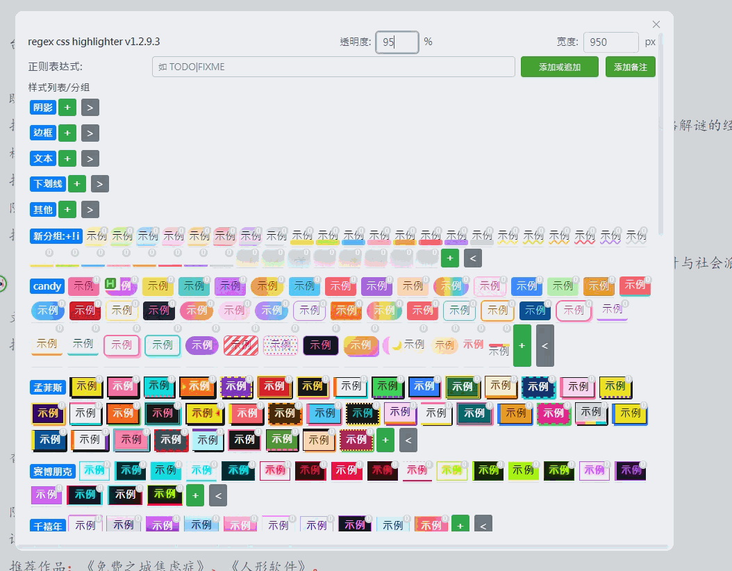
Regex-Css-Highlighter 插件介绍
通过正则表达式为文本定义高亮规则,将人物、地点、符号、标签等内容赋予独立视觉样式,让普通文本呈现清晰的层次结构。
核心功能
- 正则高亮:灵活匹配目标文本,支持捕获组分段设样
- 全局 / 文件规则:规则可全局生效,也可绑定特定文件
- CSS 编辑器:内置编辑器,每条规则独立定义样式
- AI 批量编辑:支持 AI 批量添加、修改样式
- 分类管理:对样式规则分组归类,便于维护
- 备注弹窗:悬停显示备注,主面板汇总所有备注内容
实时预览模式正常;阅读模式高亮存在部分遗漏,修复中。
使用方法
安装插件后, 按下Ctrl+ Alt+ r (默认快捷键), 打开主面板
版本/功能介绍:
v1.2.7.7主窗口显示所有备注文本
v1.2.7.9新安装插件体验优化、bug修复
v1.2.8.5备注功能、AI生成样式/备注
备注功能
AI生成样式/备注
v1.2.8.9标题样式
1.2.9.1悬浮球、实体提取
v1.2.9.1
- 添加悬浮球
- 添加实体提取功能, 用ai提取选中文本人名、地名
- 随机高亮 (用快捷键将选中文本随机高亮)+ 快捷键移除选中文本的高亮
- 合并剪贴板中文本 (选中高亮文本后按下快捷键将剪贴板中文本添加到同一规则, 比如: 选中的高亮文本是"乔治", 剪贴板中文本为"乔治·斯塔克", 按下快捷键高亮规则变成 “乔治|乔治·斯塔克”)
b站链接(1.2.9.1): https://www.bilibili.com/video/BV1bqDyBYETZ/
1.2.9.2随机切换样式
选中文本, 点击悬浮球随机切换样式
v1.2.9.3分组添加到悬浮球选项 2026年4月15日
下载链接
其他资源:
- 下面gif中样式添加自@稻米鼠的MoreHighlightStyle
MoreHighlightStyle.gif

MoreHighlightStyle 独立可复制版, 添加到插件styles.css中, 重启插件
/**
 * 独立可复制的高亮样式
 * 基于 MoreHighlightStyle.css 修改(@稻米鼠https://zji.me/)
*/

.hl-yellow {
  margin: 0 -0.2em;
  padding: 0.1em 0.2em;
  border-radius: 0.8em 0.3em;
  color: rgb(15, 15, 15);
  background: transparent;
  -webkit-box-decoration-break: clone;
  box-decoration-break: clone;
  background-image: linear-gradient(
    1deg,
    rgba(255, 233, 88, .1),
    rgba(255, 233, 88, 1) 4%,
    rgba(255, 233, 88, .3) 8%,
    rgba(255, 233, 88, .1) 50%,
    rgba(255, 233, 88, .5) 90%,
    rgba(255, 233, 88, .7) 100%,
    transparent 100%
  ),
  linear-gradient(
    90deg,
    transparent  96%,
    rgba(255, 233, 88, 1) 98%,
    rgba(255, 233, 88, 0.8) 100%
  );
}

.hl-green {
  margin: 0 -0.2em;
  padding: 0.1em 0.2em;
  border-radius: 0.8em 0.3em;
  color: rgb(15, 15, 15);
  background: transparent;
  -webkit-box-decoration-break: clone;
  box-decoration-break: clone;
  background-image: linear-gradient(
    1deg,
    rgba(188, 233, 64, .1),
    rgba(188, 233, 64, 1) 4%,
    rgba(188, 233, 64, .3) 8%,
    rgba(188, 233, 64, .1) 50%,
    rgba(188, 233, 64, .5) 90%,
    rgba(188, 233, 64, .7) 100%,
    transparent 100%
  ),
  linear-gradient(
    90deg,
    transparent  96%,
    rgba(188, 233, 64, 1) 98%,
    rgba(188, 233, 64, 0.8) 100%
  );
}

.hl-blue {
  margin: 0 -0.2em;
  padding: 0.1em 0.2em;
  border-radius: 0.8em 0.3em;
  color: rgb(15, 15, 15);
  background: transparent;
  -webkit-box-decoration-break: clone;
  box-decoration-break: clone;
  background-image: linear-gradient(
    1deg,
    rgba(88, 188, 255, .1),
    rgba(88, 188, 255, 1) 4%,
    rgba(88, 188, 255, .3) 8%,
    rgba(88, 188, 255, .1) 50%,
    rgba(88, 188, 255, .5) 90%,
    rgba(88, 188, 255, .7) 100%,
    transparent 100%
  ),
  linear-gradient(
    90deg,
    transparent  96%,
    rgba(88, 188, 255, 1) 98%,
    rgba(88, 188, 255, 0.8) 100%
  );
}

.hl-pink {
  margin: 0 -0.2em;
  padding: 0.1em 0.2em;
  border-radius: 0.8em 0.3em;
  color: rgb(15, 15, 15);
  background: transparent;
  -webkit-box-decoration-break: clone;
  box-decoration-break: clone;
  background-image: linear-gradient(
    1deg,
    rgba(255, 160, 188, .1),
    rgba(255, 160, 188, 1) 4%,
    rgba(255, 160, 188, .3) 8%,
    rgba(255, 160, 188, .1) 50%,
    rgba(255, 160, 188, .5) 90%,
    rgba(255, 160, 188, .7) 100%,
    transparent 100%
  ),
  linear-gradient(
    90deg,
    transparent  96%,
    rgba(255, 160, 188, 1) 98%,
    rgba(255, 160, 188, 0.8) 100%
  );
}

.hl-orange {
  margin: 0 -0.2em;
  padding: 0.1em 0.2em;
  border-radius: 0.8em 0.3em;
  color: rgb(15, 15, 15);
  background: transparent;
  -webkit-box-decoration-break: clone;
  box-decoration-break: clone;
  background-image: linear-gradient(
    1deg,
    rgba(255, 188, 64, .1),
    rgba(255, 188, 64, 1) 4%,
    rgba(255, 188, 64, .3) 8%,
    rgba(255, 188, 64, .1) 50%,
    rgba(255, 188, 64, .5) 90%,
    rgba(255, 188, 64, .7) 100%,
    transparent 100%
  ),
  linear-gradient(
    90deg,
    transparent  96%,
    rgba(255, 188, 64, 1) 98%,
    rgba(255, 188, 64, 0.8) 100%
  );
}

.hl-red {
  margin: 0 -0.2em;
  padding: 0.1em 0.2em;
  border-radius: 0.8em 0.3em;
  color: rgb(15, 15, 15);
  background: transparent;
  -webkit-box-decoration-break: clone;
  box-decoration-break: clone;
  background-image: linear-gradient(
    1deg,
    rgba(255, 96, 108, .1),
    rgba(255, 96, 108, 1) 4%,
    rgba(255, 96, 108, .3) 8%,
    rgba(255, 96, 108, .1) 50%,
    rgba(255, 96, 108, .5) 90%,
    rgba(255, 96, 108, .7) 100%,
    transparent 100%
  ),
  linear-gradient(
    90deg,
    transparent  96%,
    rgba(255, 96, 108, 1) 98%,
    rgba(255, 96, 108, 0.8) 100%
  );
}

.hl-purple {
  margin: 0 -0.2em;
  padding: 0.1em 0.2em;
  border-radius: 0.8em 0.3em;
  color: rgb(15, 15, 15);
  background: transparent;
  -webkit-box-decoration-break: clone;
  box-decoration-break: clone;
  background-image: linear-gradient(
    1deg,
    rgba(188, 127, 255, .1),
    rgba(188, 127, 255, 1) 4%,
    rgba(188, 127, 255, .3) 8%,
    rgba(188, 127, 255, .1) 50%,
    rgba(188, 127, 255, .5) 90%,
    rgba(188, 127, 255, .7) 100%,
    transparent 100%
  ),
  linear-gradient(
    90deg,
    transparent  96%,
    rgba(188, 127, 255, 1) 98%,
    rgba(188, 127, 255, 0.8) 100%
  );
}

.hl-gray {
  margin: 0 -0.2em;
  padding: 0.1em 0.2em;
  border-radius: 0.8em 0.3em;
  color: rgb(15, 15, 15);
  background: transparent;
  -webkit-box-decoration-break: clone;
  box-decoration-break: clone;
  background-image: linear-gradient(
    1deg,
    rgba(200, 200, 210, .1),
    rgba(200, 200, 210, 1) 4%,
    rgba(200, 200, 210, .3) 8%,
    rgba(200, 200, 210, .1) 50%,
    rgba(200, 200, 210, .5) 90%,
    rgba(200, 200, 210, .7) 100%,
    transparent 100%
  ),
  linear-gradient(
    90deg,
    transparent  96%,
    rgba(200, 200, 210, 1) 98%,
    rgba(200, 200, 210, 0.8) 100%
  );
}


.hl-half-yellow {
  margin: 0 -0.2em;
  padding: 0 0.2em;
  color: rgb(15, 15, 15);
  background: transparent;
  -webkit-box-decoration-break: clone;
  box-decoration-break: clone;
  background:
    radial-gradient(farthest-side,rgba(255, 233, 88, .8) 98%,#0000) bottom left,
    linear-gradient(rgb(255, 233, 88) 0 0) bottom,
    radial-gradient(farthest-side,rgba(255, 233, 88, .8) 98%,#0000) bottom right;
  background-size:8px 8px,calc(100% - 8px) 8px;
  background-repeat:no-repeat;
}

.hl-half-green {
  margin: 0 -0.2em;
  padding: 0 0.2em;
  color: rgb(15, 15, 15);
  background: transparent;
  -webkit-box-decoration-break: clone;
  box-decoration-break: clone;
  background:
    radial-gradient(farthest-side,rgba(188, 233, 64, .8) 98%,#0000) bottom left,
    linear-gradient(rgb(188, 233, 64) 0 0) bottom,
    radial-gradient(farthest-side,rgba(188, 233, 64, .8) 98%,#0000) bottom right;
  background-size:8px 8px,calc(100% - 8px) 8px;
  background-repeat:no-repeat;
}

.hl-half-blue {
  margin: 0 -0.2em;
  padding: 0 0.2em;
  color: rgb(15, 15, 15);
  background: transparent;
  -webkit-box-decoration-break: clone;
  box-decoration-break: clone;
  background:
    radial-gradient(farthest-side,rgba(88, 188, 255, .8) 98%,#0000) bottom left,
    linear-gradient(rgb(88, 188, 255) 0 0) bottom,
    radial-gradient(farthest-side,rgba(88, 188, 255, .8) 98%,#0000) bottom right;
  background-size:8px 8px,calc(100% - 8px) 8px;
  background-repeat:no-repeat;
}

.hl-half-pink {
  margin: 0 -0.2em;
  padding: 0 0.2em;
  color: rgb(15, 15, 15);
  background: transparent;
  -webkit-box-decoration-break: clone;
  box-decoration-break: clone;
  background:
    radial-gradient(farthest-side,rgba(255, 160, 188, .8) 98%,#0000) bottom left,
    linear-gradient(rgb(255, 160, 188) 0 0) bottom,
    radial-gradient(farthest-side,rgba(255, 160, 188, .8) 98%,#0000) bottom right;
  background-size:8px 8px,calc(100% - 8px) 8px;
  background-repeat:no-repeat;
}

.hl-half-orange {
  margin: 0 -0.2em;
  padding: 0 0.2em;
  color: rgb(15, 15, 15);
  background: transparent;
  -webkit-box-decoration-break: clone;
  box-decoration-break: clone;
  background:
    radial-gradient(farthest-side,rgba(255, 188, 64, .8) 98%,#0000) bottom left,
    linear-gradient(rgb(255, 188, 64) 0 0) bottom,
    radial-gradient(farthest-side,rgba(255, 188, 64, .8) 98%,#0000) bottom right;
  background-size:8px 8px,calc(100% - 8px) 8px;
  background-repeat:no-repeat;
}

.hl-half-red {
  margin: 0 -0.2em;
  padding: 0 0.2em;
  color: rgb(15, 15, 15);
  background: transparent;
  -webkit-box-decoration-break: clone;
  box-decoration-break: clone;
  background:
    radial-gradient(farthest-side,rgba(255, 96, 108, .8) 98%,#0000) bottom left,
    linear-gradient(rgb(255, 96, 108) 0 0) bottom,
    radial-gradient(farthest-side,rgba(255, 96, 108, .8) 98%,#0000) bottom right;
  background-size:8px 8px,calc(100% - 8px) 8px;
  background-repeat:no-repeat;
}

.hl-half-purple {
  margin: 0 -0.2em;
  padding: 0 0.2em;
  color: rgb(15, 15, 15);
  background: transparent;
  -webkit-box-decoration-break: clone;
  box-decoration-break: clone;
  background:
    radial-gradient(farthest-side,rgba(188, 127, 255, .8) 98%,#0000) bottom left,
    linear-gradient(rgb(188, 127, 255) 0 0) bottom,
    radial-gradient(farthest-side,rgba(188, 127, 255, .8) 98%,#0000) bottom right;
  background-size:8px 8px,calc(100% - 8px) 8px;
  background-repeat:no-repeat;
}

.hl-half-gray {
  margin: 0 -0.2em;
  padding: 0 0.2em;
  color: rgb(15, 15, 15);
  background: transparent;
  -webkit-box-decoration-break: clone;
  box-decoration-break: clone;
  background:
    radial-gradient(farthest-side,rgba(200, 200, 210, .8) 98%,#0000) bottom left,
    linear-gradient(rgb(200, 200, 210) 0 0) bottom,
    radial-gradient(farthest-side,rgba(200, 200, 210, .8) 98%,#0000) bottom right;
  background-size:8px 8px,calc(100% - 8px) 8px;
  background-repeat:no-repeat;
}


.hl-underline-yellow {
  margin: 0 -0.2em;
  padding: 0 0.2em;
  color: rgb(15, 15, 15);
  background: transparent;
  -webkit-box-decoration-break: clone;
  box-decoration-break: clone;
  text-decoration: underline wavy rgb(255, 233, 88) 2px;
}

.hl-underline-green {
  margin: 0 -0.2em;
  padding: 0 0.2em;
  color: rgb(15, 15, 15);
  background: transparent;
  -webkit-box-decoration-break: clone;
  box-decoration-break: clone;
  text-decoration: underline wavy rgb(188, 233, 64) 2px;
}

.hl-underline-blue {
  margin: 0 -0.2em;
  padding: 0 0.2em;
  color: rgb(15, 15, 15);
  background: transparent;
  -webkit-box-decoration-break: clone;
  box-decoration-break: clone;
  text-decoration: underline wavy rgb(88, 188, 255) 2px;
}

.hl-underline-pink {
  margin: 0 -0.2em;
  padding: 0 0.2em;
  color: rgb(15, 15, 15);
  background: transparent;
  -webkit-box-decoration-break: clone;
  box-decoration-break: clone;
  text-decoration: underline wavy rgb(255, 160, 188) 2px;
}

.hl-underline-orange {
  margin: 0 -0.2em;
  padding: 0 0.2em;
  color: rgb(15, 15, 15);
  background: transparent;
  -webkit-box-decoration-break: clone;
  box-decoration-break: clone;
  text-decoration: underline wavy rgb(255, 188, 64) 2px;
}

.hl-underline-red {
  margin: 0 -0.2em;
  padding: 0 0.2em;
  color: rgb(15, 15, 15);
  background: transparent;
  -webkit-box-decoration-break: clone;
  box-decoration-break: clone;
  text-decoration: underline wavy rgb(255, 96, 108) 2px;
}

.hl-underline-purple {
  margin: 0 -0.2em;
  padding: 0 0.2em;
  color: rgb(15, 15, 15);
  background: transparent;
  -webkit-box-decoration-break: clone;
  box-decoration-break: clone;
  text-decoration: underline wavy rgb(188, 127, 255) 2px;
}

.hl-underline-gray {
  margin: 0 -0.2em;
  padding: 0 0.2em;
  color: rgb(15, 15, 15);
  background: transparent;
  -webkit-box-decoration-break: clone;
  box-decoration-break: clone;
  text-decoration: underline wavy rgb(200, 200, 210) 2px;
}


.hl-rainbow-yellow {
  margin: 0 -0.2em;
  padding: 0 0.2em;
  color: #0f0f0f;
  background: transparent;
  -webkit-box-decoration-break: clone;
  box-decoration-break: clone;
  color: transparent;
  background:
    linear-gradient(90deg, rgb(255, 233, 88), rgb(255, 233, 88)),
    linear-gradient(90deg, rgb(255, 96, 108), rgb(255, 233, 88), rgb(188, 127, 255));
  background-size: 100% 3px, 0 3px;
  background-repeat: no-repeat;
  background-position: 100% 100%, 0 100%;
  transition: 0.5s all;
  cursor: pointer;
}
.hl-rainbow-yellow:hover {
  color: rgb(15, 15, 15);
  background-size: 0 3px, 100% 3px;
}

.hl-rainbow-green {
  margin: 0 -0.2em;
  padding: 0 0.2em;
  color: #0f0f0f;
  background: transparent;
  -webkit-box-decoration-break: clone;
  box-decoration-break: clone;
  color: transparent;
  background:
    linear-gradient(90deg, rgb(188, 233, 64), rgb(188, 233, 64)),
    linear-gradient(90deg, rgb(255, 96, 108), rgb(255, 233, 88), rgb(188, 127, 255));
  background-size: 100% 3px, 0 3px;
  background-repeat: no-repeat;
  background-position: 100% 100%, 0 100%;
  transition: 0.5s all;
  cursor: pointer;
}
.hl-rainbow-green:hover {
  color: rgb(15, 15, 15);
  background-size: 0 3px, 100% 3px;
}

.hl-rainbow-blue {
  margin: 0 -0.2em;
  padding: 0 0.2em;
  color: #0f0f0f;
  background: transparent;
  -webkit-box-decoration-break: clone;
  box-decoration-break: clone;
  color: transparent;
  background:
    linear-gradient(90deg, rgb(88, 188, 255), rgb(88, 188, 255)),
    linear-gradient(90deg, rgb(255, 96, 108), rgb(255, 233, 88), rgb(188, 127, 255));
  background-size: 100% 3px, 0 3px;
  background-repeat: no-repeat;
  background-position: 100% 100%, 0 100%;
  transition: 0.5s all;
  cursor: pointer;
}
.hl-rainbow-blue:hover {
  color: rgb(15, 15, 15);
  background-size: 0 3px, 100% 3px;
}

.hl-rainbow-pink {
  margin: 0 -0.2em;
  padding: 0 0.2em;
  color: #0f0f0f;
  background: transparent;
  -webkit-box-decoration-break: clone;
  box-decoration-break: clone;
  color: transparent;
  background:
    linear-gradient(90deg, rgb(255, 160, 188), rgb(255, 160, 188)),
    linear-gradient(90deg, rgb(255, 96, 108), rgb(255, 233, 88), rgb(188, 127, 255));
  background-size: 100% 3px, 0 3px;
  background-repeat: no-repeat;
  background-position: 100% 100%, 0 100%;
  transition: 0.5s all;
  cursor: pointer;
}
.hl-rainbow-pink:hover {
  color: rgb(15, 15, 15);
  background-size: 0 3px, 100% 3px;
}

.hl-rainbow-orange {
  margin: 0 -0.2em;
  padding: 0 0.2em;
  color: #0f0f0f;
  background: transparent;
  -webkit-box-decoration-break: clone;
  box-decoration-break: clone;
  color: transparent;
  background:
    linear-gradient(90deg, rgb(255, 188, 64), rgb(255, 188, 64)),
    linear-gradient(90deg, rgb(255, 96, 108), rgb(255, 233, 88), rgb(188, 127, 255));
  background-size: 100% 3px, 0 3px;
  background-repeat: no-repeat;
  background-position: 100% 100%, 0 100%;
  transition: 0.5s all;
  cursor: pointer;
}
.hl-rainbow-orange:hover {
  color: rgb(15, 15, 15);
  background-size: 0 3px, 100% 3px;
}

.hl-rainbow-red {
  margin: 0 -0.2em;
  padding: 0 0.2em;
  color: #0f0f0f;
  background: transparent;
  -webkit-box-decoration-break: clone;
  box-decoration-break: clone;
  color: transparent;
  background:
    linear-gradient(90deg, rgb(255, 96, 108), rgb(255, 96, 108)),
    linear-gradient(90deg, rgb(255, 96, 108), rgb(255, 233, 88), rgb(188, 127, 255));
  background-size: 100% 3px, 0 3px;
  background-repeat: no-repeat;
  background-position: 100% 100%, 0 100%;
  transition: 0.5s all;
  cursor: pointer;
}
.hl-rainbow-red:hover {
  color: rgb(15, 15, 15);
  background-size: 0 3px, 100% 3px;
}

.hl-rainbow-purple {
  margin: 0 -0.2em;
  padding: 0 0.2em;
  color: #0f0f0f;
  background: transparent;
  -webkit-box-decoration-break: clone;
  box-decoration-break: clone;
  color: transparent;
  background:
    linear-gradient(90deg, rgb(188, 127, 255), rgb(188, 127, 255)),
    linear-gradient(90deg, rgb(255, 96, 108), rgb(255, 233, 88), rgb(188, 127, 255));
  background-size: 100% 3px, 0 3px;
  background-repeat: no-repeat;
  background-position: 100% 100%, 0 100%;
  transition: 0.5s all;
  cursor: pointer;
}
.hl-rainbow-purple:hover {
  color: rgb(15, 15, 15);
  background-size: 0 3px, 100% 3px;
}

.hl-rainbow-gray {
  margin: 0 -0.2em;
  padding: 0 0.2em;
  color: #0f0f0f;
  background: transparent;
  -webkit-box-decoration-break: clone;
  box-decoration-break: clone;
  color: transparent;
  background:
    linear-gradient(90deg, rgb(200, 200, 210), rgb(200, 200, 210)),
    linear-gradient(90deg, rgb(255, 96, 108), rgb(255, 233, 88), rgb(188, 127, 255));
  background-size: 100% 3px, 0 3px;
  background-repeat: no-repeat;
  background-position: 100% 100%, 0 100%;
  transition: 0.5s all;
  cursor: pointer;
}
.hl-rainbow-gray:hover {
  color: rgb(15, 15, 15);
  background-size: 0 3px, 100% 3px;
}


.hl-mask-yellow {
  margin: 0 -0.2em;
  padding: 0 0.2em;
  color: rgb(15, 15, 15);
  background: transparent;
  -webkit-box-decoration-break: clone;
  box-decoration-break: clone;
  text-decoration: underline solid rgb(255, 233, 88) 3px;
  filter: blur(5px);
  transition: 0.2s all;
  cursor: pointer;
}
.hl-mask-yellow:hover {
  filter: blur(0px);
}

.hl-mask-green {
  margin: 0 -0.2em;
  padding: 0 0.2em;
  color: rgb(15, 15, 15);
  background: transparent;
  -webkit-box-decoration-break: clone;
  box-decoration-break: clone;
  text-decoration: underline solid rgb(188, 233, 64) 3px;
  filter: blur(5px);
  transition: 0.2s all;
  cursor: pointer;
}
.hl-mask-green:hover {
  filter: blur(0px);
}

.hl-mask-blue {
  margin: 0 -0.2em;
  padding: 0 0.2em;
  color: rgb(15, 15, 15);
  background: transparent;
  -webkit-box-decoration-break: clone;
  box-decoration-break: clone;
  text-decoration: underline solid rgb(88, 188, 255) 3px;
  filter: blur(5px);
  transition: 0.2s all;
  cursor: pointer;
}
.hl-mask-blue:hover {
  filter: blur(0px);
}

.hl-mask-pink {
  margin: 0 -0.2em;
  padding: 0 0.2em;
  color: rgb(15, 15, 15);
  background: transparent;
  -webkit-box-decoration-break: clone;
  box-decoration-break: clone;
  text-decoration: underline solid rgb(255, 160, 188) 3px;
  filter: blur(5px);
  transition: 0.2s all;
  cursor: pointer;
}
.hl-mask-pink:hover {
  filter: blur(0px);
}

.hl-mask-orange {
  margin: 0 -0.2em;
  padding: 0 0.2em;
  color: rgb(15, 15, 15);
  background: transparent;
  -webkit-box-decoration-break: clone;
  box-decoration-break: clone;
  text-decoration: underline solid rgb(255, 188, 64) 3px;
  filter: blur(5px);
  transition: 0.2s all;
  cursor: pointer;
}
.hl-mask-orange:hover {
  filter: blur(0px);
}

.hl-mask-red {
  margin: 0 -0.2em;
  padding: 0 0.2em;
  color: rgb(15, 15, 15);
  background: transparent;
  -webkit-box-decoration-break: clone;
  box-decoration-break: clone;
  text-decoration: underline solid rgb(255, 96, 108) 3px;
  filter: blur(5px);
  transition: 0.2s all;
  cursor: pointer;
}
.hl-mask-red:hover {
  filter: blur(0px);
}

.hl-mask-purple {
  margin: 0 -0.2em;
  padding: 0 0.2em;
  color: rgb(15, 15, 15);
  background: transparent;
  -webkit-box-decoration-break: clone;
  box-decoration-break: clone;
  text-decoration: underline solid rgb(188, 127, 255) 3px;
  filter: blur(5px);
  transition: 0.2s all;
  cursor: pointer;
}
.hl-mask-purple:hover {
  filter: blur(0px);
}

.hl-mask-gray {
  margin: 0 -0.2em;
  padding: 0 0.2em;
  color: rgb(15, 15, 15);
  background: transparent;
  -webkit-box-decoration-break: clone;
  box-decoration-break: clone;
  text-decoration: underline solid rgb(200, 200, 210) 3px;
  filter: blur(5px);
  transition: 0.2s all;
  cursor: pointer;
}
.hl-mask-gray:hover {
  filter: blur(0px);
}
- 连续三次点击鼠标左键(选中段落)执行快捷键的ahk脚本, 可以配合实体提取功能
ahk脚本
lastClickTime := 0, clickCount := 0
~LButton::
    ; 静态变量,记录上次点击时间和点击次数


    ; 获取当前时间戳(毫秒)
    currentTime := A_TickCount

    ; 两次点击间隔小于400毫秒则计为连续点击
    if (currentTime - lastClickTime < 400)
        clickCount++
    else
        clickCount := 1
    ; 如果连续点击三次
    if (clickCount = 3)
    {
        ;~ MsgBox, 64, 提示, 你刚刚连续点击了三次鼠标!
        Sleep 500
      Send, ^#+s

        clickCount := 0
    }
    ; 记录这次点击时间
    lastClickTime := currentTime
return