熊猫别熬夜
(噗~)
1
分栏分列布局 (Column-Page)
这是一个用于 Obsidian 中的分列布局样式,将笔记内容分栏显示,适用于包含大量内容或是需要目录索引的页面。
视图类型
横向分布
高度不变,宽度随内容变化,元素不能跨列分区
纵向分布
纵向模式,宽度不变,元素可以跨列分区
使用方法
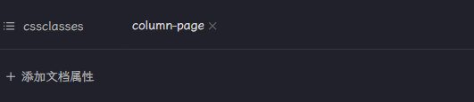
在当前笔记的属性(Properties)面板的cssclasses属性中添加column-page属性值:
调整视图类型
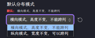
- 从Style Setting设置中调整默认视图类型:
- 默认
column-page视图为纵向视图,可以切换:
- 直接修改视图属性:
- 设置
column-page-v属性,即直接设置纵向视图
- 将
column-page→column-page-v
- 设置
column-page-h属性,即直接设置横向视图
- 将
column-page→column-page-h
常驻分列视图(不推荐)
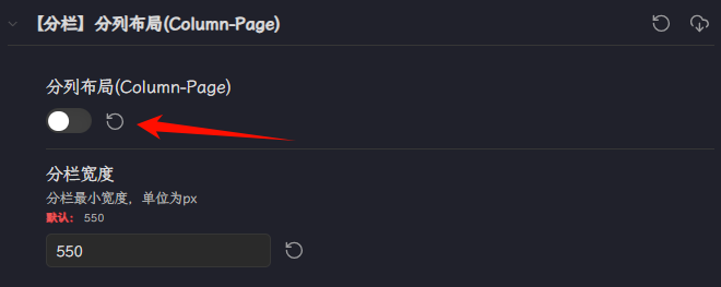
可以设置默认所有界面在阅读模式下为分列布局的样式,需要在Style Setting插件设置面板中设置:
CSS样式
/* @settings
name: 【分栏】分栏布局(Column-Page)
id: ColumnPage
settings:
  - id: column-page
    title: 分列布局(Column-Page)
    type: class-toggle
    addCommand: true
  - id: column-page-width
    title: 分栏宽度
    description: 分栏最小宽度,单位为px
    type: variable-number
    default: 550
    format: px
  - id: column-page-type
    title: 默认分布模式
    type: class-select
    allowEmpty: false
    options:
      - value: column-h
        label: 横向模式,高度不变,不能跨列
      - value: column-v
        label: 纵向模式,宽度不变,可以跨列
    default: column-h
*/
/*! 分栏布局页面  by 熊猫 */
body {
  --column-page-width: 550px;
}
.column-v.column-page,
.column-v .column-page,
.column-page-v{
  & .markdown-preview-section {
    --file-line-width: 100% !important;

    & .snw-header-count-wrapper {
      right: unset;
    }

    column-gap: 2rem;
    column-width: var(--column-page-width) !important;
    column-rule: 2px dashed var(--background-modifier-border);
    column-fill: balance;
    /* 缩减底部空白 不然可能加载成空白页 */
    padding-bottom: 0px !important;
    min-height: unset !important;

    /* 字体大小和行内高度改变,你可以不改变,并删掉 */
    font-size: 18px !important;
    line-height: 160%;

    /* 标题更紧凑一点 */
    & h2, h3, h4, h5, h6 {
      margin-top: 10px;
      margin-bottom: 5px;
    }

    /* 选择不分列的元素,默认为h1,hr */
    & h1, hr {
      column-span: all;
    }

    /* 多列布局后,部分列表圆点会错位,这样可以避免 */
    & .list-bullet {
      position: absolute;
    }
  }

  &.column-h2 h2 {
    column-span: all;
  }
}
.column-h.column-page,
.column-h .column-page,
.column-page-h{
  & .markdown-preview-section {
    --file-line-width: 100% !important;

    & .snw-header-count-wrapper {
      right: unset;
    }

    column-gap: 2rem;
    column-width: var(--column-page-width) !important;
    column-rule: 2px dashed var(--background-modifier-border);
    column-fill: auto;
    height: 100%;
    /* 缩减底部空白 不然可能加载成空白页 */
    padding-bottom: 0px !important;
    min-height: unset !important;

    /* 字体大小和行内高度改变,你可以不改变,并删掉 */
    font-size: 18px !important;
    line-height: 160%;

    /* 标题更紧凑一点 */
    & h2, h3, h4, h5, h6 {
      margin-top: 10px;
      margin-bottom: 5px;
    }

    /* 多列布局后,部分列表圆点会错位,这样可以避免 */
    & .list-bullet {
      position: absolute;
    }
  }
}
7 个赞
熊猫别熬夜
(噗~)
3
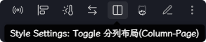
可以设置全局布局的切换命令,临时需要双页视图阅读的时候方便调用。
Collins
(Collins Scott)
5
已完成横向纵向调节,想问问图中 纵向分两栏是怎么操作的
熊猫别熬夜
(噗~)
8
请问添加snippet并声明cssclass后,写笔记时是有什么格式才能实现分栏吗?抱歉问题很小白
熊猫别熬夜
(噗~)
11
只在阅读模式下生效,设置完cssclass后,直接启动阅读模式就可以了。
把侧边栏都关掉后看到分栏了,不过纵向模式似乎是内容均分,不能自定义局部内容分栏是吗?
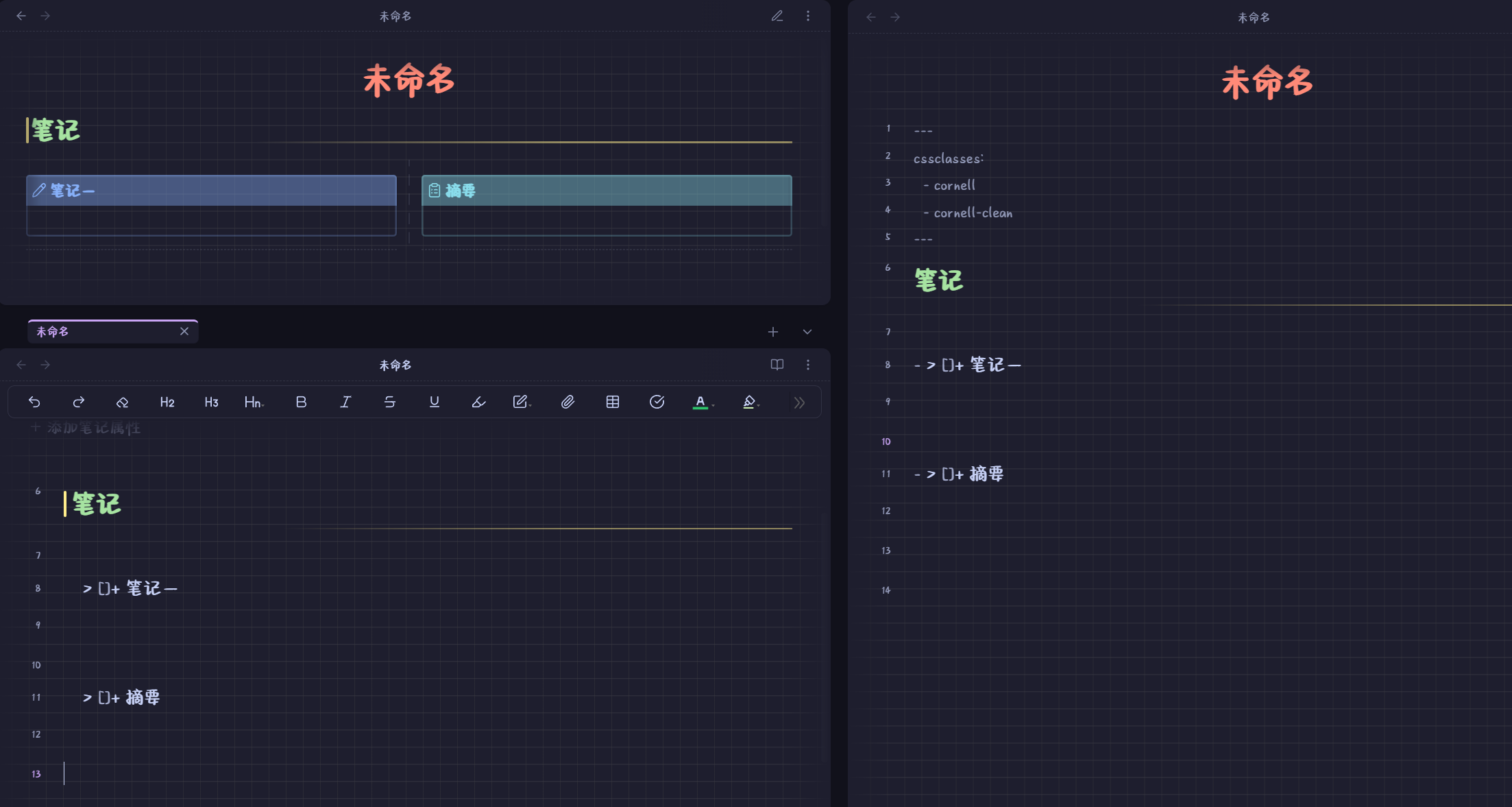
彭潇洋
14
我这是个自定义局部分栏的css代码
/*
Cornell Notes
By: Jose Moruno Cadima aka @sniferl4bs
https://youtube.com/sniferl4bs
v0.2 - Optimized
https://github.com/Snifer/CornellNotes/blob/main/.obsidian/snippets/cornell.css
*/

:root {
    --sticky-note-color: transparent;
}

/* Cornell Notes Styles */
.cornell .footnotes {
    font-size: 16px;
}

.cornell .footnotes > hr {
    background-color: red !important;
    height: 2.5rem;
    visibility: hidden;
}

.cornell .footnotes > hr:after {
    content: 'http://www.w3.org/2000/svg';
    color: skyblue;
    border-bottom: 2px dashed orangered;
    visibility: visible;
    font-size: 22px;
    padding: 0.1rem 0.1rem;
    margin-top: 0.2rem;
}

.cornell .footnotes > hr:before,
.cornell-clean .markdown-embed-title,
.cornell .list-bullet {
    display: none;
}

/* Clean Embeds */
.cornell .clean-embeds {
    --embed-background: inherit;
    --embed-border-left: 0px solid var(--interactive-accent);
    --embed-border-right: none;
    --embed-border-top: none;
    --embed-border-bottom: none;
    --embed-padding: 0;
    --embed-font-style: inherit;
}

.cornell .clean-embeds .markdown-rendered .markdown-embed {
    max-width: 100%;
}

.cornell .clean-embeds .markdown-rendered .markdown-embed .markdown-rendered {
    padding-left: 0;
}

.cornell .clean-embeds .markdown-embed-link {
    visibility: hidden;
}

/* Cornell Note Lists */
.cornell ul:not(ul ul) {
    display: grid;
    grid-template-columns: 1fr 0.15rem 1fr;
    column-gap: 0.9rem;
    margin: 0.2rem 0;
}

.cornell ul:not(ul ul) > li {
    font-size: 1.2rem;
    line-height: 2;
    padding: 0;
    margin: 0 0 2rem 0;
    position: relative;
}

.cornell ul:not(ul ul) > li:nth-child(2n+1) {
    grid-column: 1;
    text-align: left;
}

.cornell ul:not(ul ul) > li:nth-child(2n+2) {
    grid-column: 3;
}

.cornell ul:not(ul ul) > li:not(:first-child)::before,
.cornell ul:not(ul ul) > li:nth-child(2n+1)::before {
    content: '';
    position: absolute;
    border-bottom: 0.1rem dashed var(--text-normal);
    opacity: 0.2;
    width: 100%;
    bottom: -2.25rem;
    transform: translateY(50%);
}

.cornell ul:not(ul ul)::after {
    content: '';
    height: 100%;
    width: 0.15rem;
    grid-column: 2 / 3;
    grid-row: 1 / span 1000;
    background-image: linear-gradient(var(--text-normal) 60%, rgba(255, 255, 255, 0) 0%);
    background-position: right;
    background-size: 0.15rem 1.5rem;
    background-repeat: repeat-y;
    opacity: 0.1;
}

/* Image Styles */
img {
    margin-top: 4px;
    border-radius: 4px;
    overflow: hidden;
}

img[alt~='img-right'] { float: right; margin-left: 1rem; }
img[alt~='img-left'] { float: left; margin-right: 1rem; }
img[alt~='img-center'] { display: block; margin: auto; }
img[alt~='round'] { width: 30%; height: 30%; border-radius: 50%; }
img[alt~='avatar'] { width: 100px; height: 100px; object-fit: cover; display: block; }
img[alt~='portrait'] { width: 240px; height: 400px; object-fit: cover; }

img[alt="banner"] {
    position: absolute;
    top: 0;
    left: 0;
    width: 100%;
    height: 110px;
    object-fit: cover;
    -webkit-mask-image: linear-gradient(180deg, white, white, white, transparent);
    mask-image: none;
    object-position: 50% var(--banner-v-align);
    border-radius: 0 !important;
    pointer-events: none;
}

.markdown-preview-view img:is([alt="banner"], [alt="banner-b"]) .frontmatter-container {
    display: none;
}

/* Banner positioning classes */
.bc-10 img[alt="banner"] { object-position: 50% 10%; }
.bc-20 img[alt="banner"] { object-position: 50% 20%; }
.bc-30 img[alt="banner"] { object-position: 50% 30%; }
.bc-40 img[alt="banner"] { object-position: 50% 40%; }
.bc-50 img[alt="banner"] { object-position: 50% 50%; }
.bc-60 img[alt="banner"] { object-position: 50% 60%; }

/* Image captions */
.image-embed[src*="#cap"]::after {
    content: attr(alt);
    color: var(--text-normal);
    display: flex;
    font-size: smaller;
    max-width: fit-content;
    padding: 2px 8px;
    margin-top: -6px;
    text-align: center;
}

/* Callout styles */
.callout {
    height: 100%;
    overflow: auto;
    font-size: 1.2rem;
    line-height: auto;
    width: auto;
}

/* Print Styles */
@media print {
    @page {
        margin: 1cm 0cm !important;
    }

    a:link, a:visited, a {
        text-decoration: none !important;
    }

    body {
        tab-size: 4 !important;
        --code-background: white !important;
        --code-normal: black !important;
    }

    p, h1, h2, h3, h4, h5, h6, del, code, table, ul, ol, dl {
        font-family: "Times New Roman", "楷体" !important;
    }

    p {
        font-size: 12pt !important;
        text-align: justify !important;
        line-height: 1.5 !important;
        margin-top: 5px !important;
    }

    h1, h2, h3, h4, h5, h6 {
        color: black !important;
        page-break-after: avoid;
        page-break-inside: avoid;
        font-size: 12pt !important;
        font-weight: bold !important;
        line-height: 1.3 !important;
        margin: 20px 0 0 0 !important;
        padding: 0 !important;
    }

    h1 {
        text-align: center !important;
        font-size: 18pt !important;
        margin-top: 0px !important;
        counter-reset: H2;
    }

    h6 {
        text-align: center !important;
        font-size: 10pt !important;
        margin-top: 6px !important;
    }

    h2:before { counter-increment: H2; content: counter(H2) ". \0000a0"; }
    h2 { counter-reset: H3; }
    h3:before { counter-increment: H3; content: counter(H2) "." counter(H3) ". \0000a0"; }
    h3 { counter-reset: H4; }
    h4:before { counter-increment: H4; content: counter(H2) "." counter(H3) "." counter(H4) ". \0000a0"; }

    del {
        display: block !important;
        text-align: center !important;
        font-size: 10pt !important;
        text-decoration: none;
        margin-top: 8px !important;
        padding-bottom: 10px !important;
    }

    pre {
        background-color: #fff !important;
        border: 1px dashed darkgray !important;
        border-width: 1px 0px !important;
        border-radius: 0px !important;
        line-height: 1 !important;
    }

    code {
        font-family: "Latin Modern Mono" !important;
        font-size: 10pt !important;
        color: #292929 !important;
    }

    mjx-math { font-size: 90% !important; }
    math-block { page-break-before: avoid !important; }

    svg, img {
        display: block !important;
        page-break-inside: avoid !important;
        page-break-after: avoid !important;
        margin: 10px auto 5px !important;
    }

    figcaption {
        font-family: "Latin Modern Roman" !important;
        text-align: center !important;
        margin-bottom: 16px !important;
        font-size: 8pt !important;
    }

    table, pre { page-break-inside: avoid !important; }

    table {
        font-size: 10pt !important;
        text-align: center !important;
        margin: 10px auto 5px !important;
        border-top: 1px solid #292929 !important;
        border-bottom: 1px solid #292929 !important;
    }

    th {
        color: black !important;
        font-weight: normal !important;
        border: none !important;
        border-bottom: 1px solid darkgray !important;
        padding: 2px 5px !important;
    }

    td {
        border: none !important;
        padding: 2px 5px !important;
    }

    ul, ol, dl {
        page-break-before: avoid !important;
        font-weight: normal !important;
        font-size: 11pt !important;
        line-height: 1.1 !important;
        margin-top: 0px !important;
        padding-top: 0px !important;
    }

    ul li {
        list-style-type: none !important;
        position: relative !important;
    }

    ul li::before {
        content: none !important;
    }

    hr {
        border: none !important;
        border-top: 0px solid lightgray !important;
    }

    blockquote {
        display: block !important;
        text-align: center !important;
        font-size: 10pt !important;
        color: black !important;
        border: none !important;
        padding: 0px !important;
        margin: 5px auto !important;
    }

    .mermaid {
        color: black !important;
    }
}
熊猫别熬夜
(噗~)
16
可以写个Callout样式设置分栏,也可以使用Anyblock插件用列表实现。