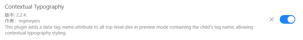
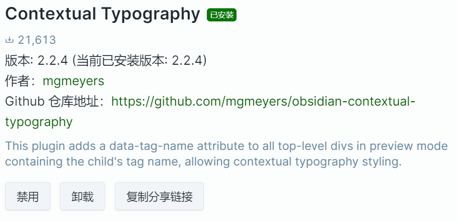
1.下载安装Contextual Typography的最新版本
2.复制以下代码,改文件后缀为 .css 或者直接从插入图片分列下载
/* This snippet requires Contextual Typography 2.2.1+ */
/* https://github.com/mgmeyers/obsidian-contextual-typography */
:root {
--content-base-width: 45rem;
}
/* ----------------------------------------- */
/* Handle overall content width */
/* ----------------------------------------- */
/* Wrapper with padding keeps content from bumping the edges */
.markdown-preview-view.is-readable-line-width {
padding-inline: 30px;
}
/* Container controlling overall max content width */
.markdown-preview-view.is-readable-line-width .markdown-preview-section {
width: 100%;
max-width: var(--content-max-width, 45rem); /* Second value is fallback in case user isn't using Style settings */
}
/* All children of overall container are divs */
.markdown-preview-view.is-readable-line-width .markdown-preview-section > div {
margin-inline: auto;
width: min(var(--content-base-width), 100%);
}
/* Specific children of overall container that contain media */
.markdown-preview-view.is-readable-line-width .markdown-preview-section div[data-is-embed] {
width: 100%;
}
/* ----------------------------------------- */
/* Make media items display in rows */
/* ----------------------------------------- */
/* p tags wrap each row */
.markdown-preview-view.is-readable-line-width .markdown-preview-section div[data-is-embed] > p {
display:grid;
grid-template-columns:repeat(auto-fit, minmax(0, 1fr));
grid-gap: var(--media-grid-gap, 7px);
margin: 0;
}
/* Remove breaks from the document flow */
.markdown-preview-view.is-readable-line-width .markdown-preview-section div[data-is-embed] > p br {
display: none;
}
/* Media items sourced from your vault are wrapped in a span – media linked from the web is not wrapped */
.markdown-preview-view.is-readable-line-width .markdown-preview-section div[data-is-embed] > p > span {
display: flex;
}
/* Apply this to all img/video tags in a row whether they're wrapped in a span or not */
.markdown-preview-view.is-readable-line-width .markdown-preview-section div[data-is-embed] > p img,
.markdown-preview-view.is-readable-line-width .markdown-preview-section div[data-is-embed] > p video {
flex: 1;
align-self: stretch;
object-fit: cover;
border-radius: var(--media-border-radius, 4px);
}
/* Create gaps between rows */
.markdown-preview-view.is-readable-line-width .markdown-preview-section div[data-is-embed] + div[data-is-embed] {
margin-top: var(--media-grid-gap, 7px);
}
/* ----------------------------------------- */
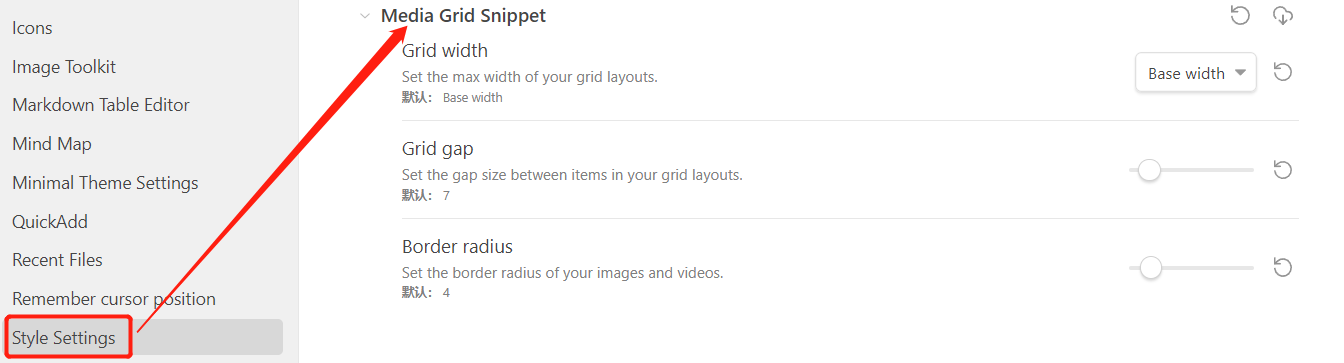
/* Style settings */
/* ----------------------------------------- */
/* @settings
name: Media Grid Snippet
id: media-grid-snippet
settings:
-
id: content-max-width
title: Grid width
description: Set the max width of your grid layouts.
type: variable-select
allowEmpty: false
default: var(--content-base-width)
options:
-
label: Base width
value: var(--content-base-width)
-
label: Small
value: calc(var(--content-base-width) + 5%)
-
label: Medium
value: calc(var(--content-base-width) + 10%)
-
label: Large
value: calc(var(--content-base-width) + 20%)
-
label: Full width
value: 100%
-
id: media-grid-gap
title: Grid gap
description: Set the gap size between items in your grid layouts.
type: variable-number-slider
format: px
default: 7
min: 0
max: 80
step: 1
-
id: media-border-radius
title: Border radius
description: Set the border radius of your images and videos.
type: variable-number-slider
format: px
default: 4
min: 0
max: 40
step: 1
*/
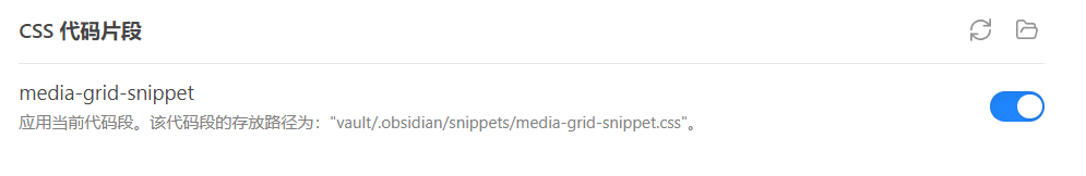
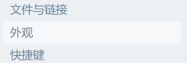
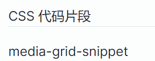
3.在设置中选择外观,拉到最底部 css 代码片段选项,点击文件夹图标选择第二步中创建的 .css 文件,点击文件夹图标旁边的更新图标,更新。
4.打开第二步中 .css 文件的按钮,完成。
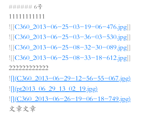
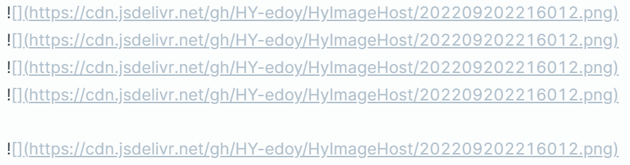
5.图片插入示例:插入的图片链接两行之间不要空行,自动实现图片分列效果
6.效果

原教程地址:
Obsidian插入图片分列
参考教程:
Obsidian 图片分列显示